

add. language
OpenSkin Designer (OSD)
-
- E2 Skin Tools
- joeuser
- Thread is marked as Resolved.
-
-
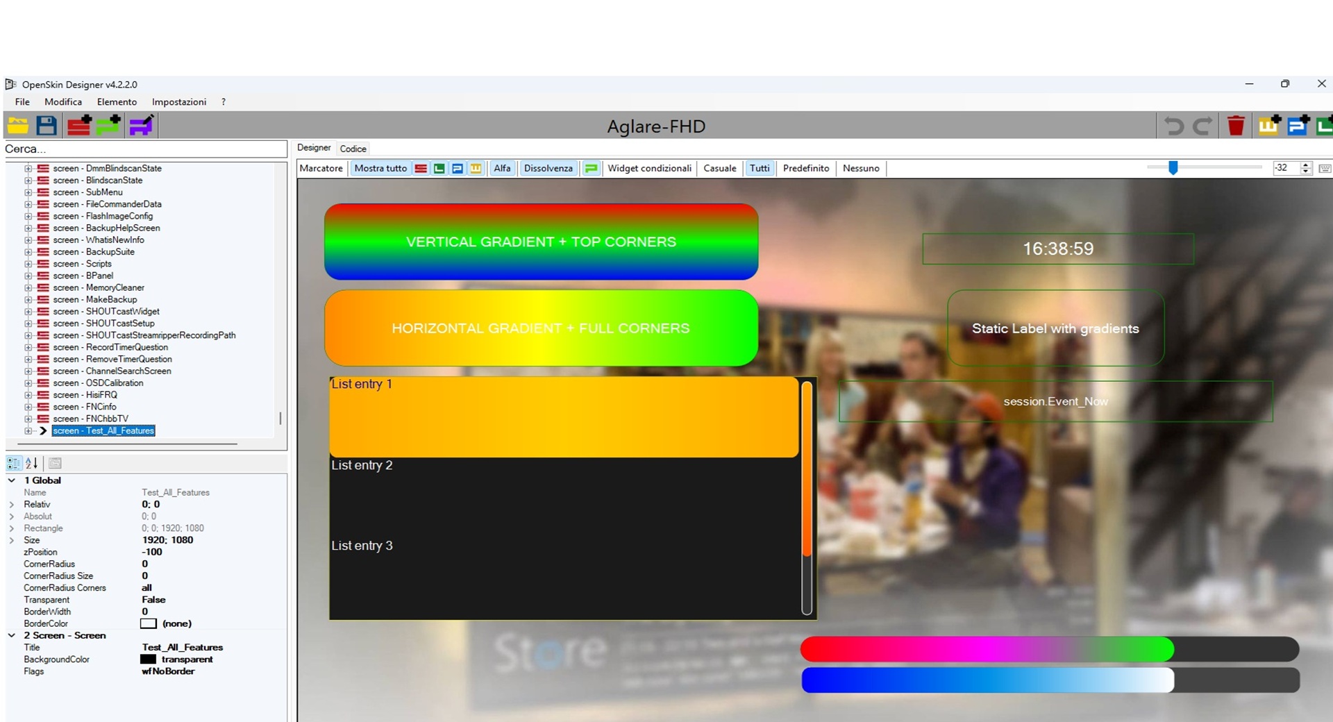
4.2.0.0 - Gradient backgroundColor and cornerRadius mask support
Added
- Added support for Enigma2-style
backgroundColorgradients oneLabel. - Added support for 3-part gradient syntax:
backgroundColor="#00101010,#00303030,vertical"backgroundColor="red,green,vertical"backgroundColor="#00ff0000,#0000ff00,vertical"
- Added support for preserving extended
cornerRadiussyntax:cornerRadius="30;topLeft,topRight"cornerRadius="30;bottomLeft,bottomRight"cornerRadius="30;left"cornerRadius="30;right"
Changed
- Improved color parsing so comma-separated gradient values are no longer treated as invalid single colors.
- Updated
eLabelbackground handling sobackgroundColorcan be used for both normal colors and gradients. - Updated
cornerRadiushandling to save the original raw value instead of reducing it to a plain numeric radius. - Improved preview rendering so corner-radius edge masks are respected visually.
Fixed
- Fixed saving of
backgroundColor="#00101010,#00303030,vertical". - Fixed saving of
backgroundColor="red,green,vertical". - Fixed saving of
backgroundColor="#00ff0000,#0000ff00,vertical". - Fixed saving of
cornerRadius="30;topLeft,topRight". - Fixed preview issue where
cornerRadius="30;topLeft,topRight"was displayed as rounded on all four corners.
Notes
- Existing normal color values such as
backgroundColor="#00ffffff"andbackgroundColor="red"continue to work. - Existing simple radius values such as
cornerRadius="30"continue to round all corners.
thanks for Lululla
- Added support for Enigma2-style
-
I didn't even know that it works like that in OpenATV too. Which other images does it work in as well?
-
 Display More
4.2.0.0 - Gradient backgroundColor and cornerRadius mask support
Added
- Added support for Enigma2-style
backgroundColorgradients oneLabel. - Added support for 3-part gradient syntax:
backgroundColor="#00101010,#00303030,vertical"backgroundColor="red,green,vertical"backgroundColor="#00ff0000,#0000ff00,vertical"
- Added support for preserving extended
cornerRadiussyntax:cornerRadius="30;topLeft,topRight"cornerRadius="30;bottomLeft,bottomRight"cornerRadius="30;left"cornerRadius="30;right"
Changed
- Improved color parsing so comma-separated gradient values are no longer treated as invalid single colors.
- Updated
eLabelbackground handling sobackgroundColorcan be used for both normal colors and gradients. - Updated
cornerRadiushandling to save the original raw value instead of reducing it to a plain numeric radius. - Improved preview rendering so corner-radius edge masks are respected visually.
Fixed
- Fixed saving of
backgroundColor="#00101010,#00303030,vertical". - Fixed saving of
backgroundColor="red,green,vertical". - Fixed saving of
backgroundColor="#00ff0000,#0000ff00,vertical". - Fixed saving of
cornerRadius="30;topLeft,topRight". - Fixed preview issue where
cornerRadius="30;topLeft,topRight"was displayed as rounded on all four corners.
Notes
- Existing normal color values such as
backgroundColor="#00ffffff"andbackgroundColor="red"continue to work. - Existing simple radius values such as
cornerRadius="30"continue to round all corners.
thanks for Lululla
Thank you to several developers for the continued updates and for your selfless sharing!
Below is the Simplified Chinese translation file:
- Added support for Enigma2-style
-
I didn't even know that it works like that in OpenATV too. Which other images does it work in as well?
Di you mean corner radius ? , it works with all new versions of Images
-
Curve radius was already included, now with top bot etc.
but background gradient wasn't there at the beginning.
I think you also didn't use the latest version.
-
Curve radius was already included, now with top bot etc.
but background gradient wasn't there at the beginning.
I think you also didn't use the latest version.
The latest ATV skin updates , the gradient attributes working by backgroundColor not backgroundGradient, , so the latest OSD 4.1.0.0 is depending on backgroundGradient to make the app renderer preview the gradient color, and if used backgroundColor , it preview Fuschia color as it read the attribute as one value , so it is better to update the OSD to deal with the new updates and deal with the attribute as more than one value if there are more than one value seperated by "," .
As regard Curve radius , it is included in 4.1.0.0 but it deals with radius as one value , the new ATV skin updates deals with the radius as more than one value separated by ";" .
-
Of course I didn't use 4.1.0.0 as a base ,I don't have its source , I used Humaxx source , it works great with visual studio.
-
-
We'll find a shared solution, I'm sure of it. :)
The fault always lies with whoever updates skin.py :)
-
-
I did it back then because it started with gradients, but it didn't work in all areas yet – sometimes sliders, sometimes scrollbars – so I gave up. I've also already added input fields. Take a look and see if you can use anything.
-
That's a shame, you knew I'd continued.
I wrote to Lululla, maybe you could include that in a future version, but that's up to you.
You can use visual studio and clone repo
-
-
MOD v4.2.1.0 highlights
This MOD focuses on compatibility with newer Enigma2 skin syntax while keeping the original OpenSkin Designer workflow.
Added/updated support includes:
eLabelbackgroundColorgradients using 3-part syntax:startColor,endColor,direction- HEX gradient values such as
backgroundColor="#00101010,#00303030,vertical" - Named-color gradients such as
backgroundColor="red,green,vertical" cornerRadiusmasks such ascornerRadius="30;topLeft,topRight"- Correct saving of raw gradient and corner-radius mask values without reducing them to simple colors/numbers
- Preview rendering that respects partial rounded corners, for example top-left and top-right only
- Property-grid editors for gradient colors/direction instead of editing only raw strings
- Progress and slider preview/editing for background color, foreground color, and foreground gradients
- Listbox preview/editing for grid orientation, item gradients, selected item gradients, item radius, scrollbar radius, and scrollbar colors
-
I compared the 2 readme.. and there are some things that can be updated in both projects to unify them if you want
Features (from the README)
Code
Display MoreUnify gradients into single properties ✅ Yes ❌ Probably not (still uses ...1/2/3) Source, Render properties for labels ✅ Yes ❌ Not mentioned Text, Valign, Halign, noWrap properties in widgets ✅ Yes ❌ Not mentioned ProgressColor property in widgets ✅ Yes ❌ Not mentioned ForegroundColor → gradient fallback ✅ Yes ❌ Not mentioned Cleanup (remove duplicates, useless variables) ✅ Yes ❌ Probably not Numeric cornerRadius support ✅ Yes ✅ Yes (but it also supports masks) Mask cornerRadius support ❌ No ✅ Yes Property-grid editor for gradients (visual) ❌ No ✅ Yes Slider widget support ❌ No ✅ Yes (maybe) Grid orientation for listboxes ❌ No ✅ Yes (maybe) -
MOD v4.2.1.0 highlights
This MOD focuses on compatibility with newer Enigma2 skin syntax while keeping the original OpenSkin Designer workflow.
Added/updated support includes:
eLabelbackgroundColorgradients using 3-part syntax:startColor,endColor,direction- HEX gradient values such as
backgroundColor="#00101010,#00303030,vertical" - Named-color gradients such as
backgroundColor="red,green,vertical" cornerRadiusmasks such ascornerRadius="30;topLeft,topRight"- Correct saving of raw gradient and corner-radius mask values without reducing them to simple colors/numbers
- Preview rendering that respects partial rounded corners, for example top-left and top-right only
- Property-grid editors for gradient colors/direction instead of editing only raw strings
- Progress and slider preview/editing for background color, foreground color, and foreground gradients
- Listbox preview/editing for grid orientation, item gradients, selected item gradients, item radius, scrollbar radius, and scrollbar colors
As usual, excellent work Mohammed is added to your creative updates and I hope that more features will be added that facilitate the work of designers.
It will be nice if you can add
1. self debugging option to revise the xml prior save it or add something like multiple auto save point to restore the work incase of shit happen.
2. Add option to multiple select dragging /moving for group of items within same screen, instead of adjust it one by one.
3. Add option to multiple copy paste for set of items by select it from one screen to another instead of move it by code.
4. Add option to real time detect for x&y position for item, by holding specific item and move it by mouse.
5. Add ruler 📏 vertical and horizontal to the main program screen.
6. Add auto organizer or filter to screen components like filter the elable only to be visible or filter the widget only...etc this will help to focus on some component in complex screens.
7. Add option to select screen and move it up/down from the right tree within the xml file.
I know that some proposals seem complicated or require deep modifications in the structure of the system, but they are suggestions that came to my mind and I wanted to share with you with the intention of encouragement.
my greetings
-

I compared the 2 readme.. and there are some things that can be updated in both projects to unify them if you want
Features (from the README)
Code
Display MoreUnify gradients into single properties ✅ Yes ❌ Probably not (still uses ...1/2/3) Source, Render properties for labels ✅ Yes ❌ Not mentioned Text, Valign, Halign, noWrap properties in widgets ✅ Yes ❌ Not mentioned ProgressColor property in widgets ✅ Yes ❌ Not mentioned ForegroundColor → gradient fallback ✅ Yes ❌ Not mentioned Cleanup (remove duplicates, useless variables) ✅ Yes ❌ Probably not Numeric cornerRadius support ✅ Yes ✅ Yes (but it also supports masks) Mask cornerRadius support ❌ No ✅ Yes Property-grid editor for gradients (visual) ❌ No ✅ Yes Slider widget support ❌ No ✅ Yes (maybe) Grid orientation for listboxes ❌ No ✅ Yes (maybe)In the meantime that oldem2014 finishes all the new features, let's see how this test behaves?
removed all old error on root structure.
Release v4.2.1.0 MOD by Lululla · OwnerPlugins/OpenSkin-Designer
and added
Release v4.2.2.0 MOD by Lululla · OwnerPlugins/OpenSkin-Designer
-
New test today v.4.2.3.0
Feature Status Location selectionZoomfor listbox✅ Done sGraphicListbox.cs– selected item zoomNew eSliderwidget✅ Done sAttributeSlider.cs+sGraphicSlider.cs+ integration insAttributeWidgetandsGraphicWidgetscrollbarBackgroundGradient✅ Done sAttributeListbox.cs(property) + rendering insGraphicListboxGradients for any widget ✅ Done Base sAttributewithBackgroundGradient,ForegroundGradient, helperExtended ClockToText✅ Done strftime.ToString+ClockToText.getTextwith%l,%I,%e,%p,%P,lowerAmpmExtended ServiceName✅ Done Added ChannelNumber,ChannelNumberAndName,PiconName,ReferenceNameExample:
Code
Display More<skin> <screen name="TestListboxZoom" position="0,0" size="1920,1080" backgroundColor="transparent" flags="wfNoBorder"> <widget render="Listbox" position="100,100" size="800,600" font="Regular; 28" selectionZoom="20" selection="2" itemHeight="50" backgroundColor="black" foregroundColor="white"/> </screen> <screen name="TestListboxZoomAdvanced" position="0,0" size="1920,1080" backgroundColor="transparent" flags="wfNoBorder"> <widget render="Listbox" position="100,100" size="800,600" font="Regular; 34" selectionZoom="30" selection="1" itemHeight="60" itemCornerRadius="10" backgroundColor="#1a1a1a" foregroundColor="#eeeeee" backgroundColorSelected="#333333" foregroundColorSelected="#ffcc00" itemGradient="#222222,#444444,#222222,vertical" itemGradientSelected="#ffaa00,#ffcc00,#ffaa00,horizontal" scrollbarMode="showAlways" scrollbarWidth="15" scrollbarOffset="5" scrollbarRadius="8" scrollbarForegroundGradient="#ffaa00,#ff8800,#ff5500,vertical"/> </screen> <screen name="TestListboxFeatures" position="0,0" size="1920,1080" backgroundColor="transparent" flags="wfNoBorder"> <!-- Test listbox with selectionZoom and scrollbarBackgroundGradient --> <widget render="Listbox" position="100,100" size="800,500" font="Regular; 26" itemHeight="60" selection="2" selectionZoom="30" scrollbarMode="showAlways" scrollbarWidth="16" scrollbarOffset="8" scrollbarRadius="8" scrollbarBackgroundGradient="#333333,#555555,#333333,vertical" scrollbarSliderForegroundColor="gold" scrollbarSliderBackgroundColor="#222222" scrollbarSliderBorderColor="white" scrollbarSliderBorderWidth="2" foregroundColor="#eeeeee" backgroundColor="#1a1a1a" foregroundColorSelected="#ffcc00" backgroundColorSelected="#333333"/> <!-- Explanatory label --> <eLabel position="100,620" size="800,60" text="Select an item with the mouse. The selected item (index 2) should be enlarged by 30%." font="Regular; 20" foregroundColor="white" backgroundColor="transparent" halign="center"/> </screen> <screen name="TestSlider" position="0,0" size="1920,1080" backgroundColor="transparent" flags="wfNoBorder"> <widget render="Slider" position="100,100" size="800,40" min="0" max="100" value="35" step="5" orientation="horizontal" backgroundColor="#333333" foregroundColor="#ffcc00" borderWidth="1" borderColor="white" cornerRadius="10"/> <widget render="Slider" position="100,200" size="40,400" min="0" max="100" value="75" orientation="vertical" backgroundColor="#333333" foregroundGradient="red,yellow,green,vertical" borderWidth="1" borderColor="white"/> </screen> <screen name="TestSliderWidget" position="0,0" size="1920,1080" backgroundColor="transparent" flags="wfNoBorder"> <!-- Simple horizontal slider --> <widget render="Slider" position="100,100" size="800,40" min="0" max="100" value="35" step="5" orientation="horizontal" backgroundColor="#333333" foregroundColor="#ffcc00" borderWidth="2" borderColor="white" cornerRadius="10" zPosition="1"/> <!-- Horizontal slider with background and foreground gradient --> <widget render="Slider" position="100,200" size="800,40" min="0" max="100" value="65" orientation="horizontal" backgroundGradient="#222222,#444444,#222222,horizontal" foregroundGradient="red,yellow,green,horizontal" borderWidth="1" borderColor="silver" cornerRadius="20" zPosition="1"/> <!-- Vertical slider with vertical gradient --> <widget render="Slider" position="100,300" size="40,400" min="0" max="100" value="75" orientation="vertical" backgroundColor="#555555" foregroundColor="cyan" borderWidth="2" borderColor="black" cornerRadius="15" zPosition="1"/> <!-- Vertical slider with images (pixmap) – if the file exists, otherwise use color/gradient --> <widget render="Slider" position="200,300" size="60,400" min="0" max="100" value="50" orientation="vertical" pixmap="slider_thumb.png" scale="1" alphatest="blend" backgroundColor="#111111" foregroundGradient="blue,cyan,white,vertical" borderWidth="1" borderColor="gray" cornerRadius="8" zPosition="1"/> <!-- Informational label --> <eLabel position="100,750" size="1000,60" text="eSlider test: move the cursor with the mouse (preview only) or change the values from the property grid." font="Regular; 20" foregroundColor="white" backgroundColor="transparent" halign="center"/> </screen> <screen name="ClockTestScreen" position="0,0" size="1920,1080" title="Test new clock formats" backgroundColor="3-Buttonshadowfarbe"> <!-- Widget 1: standard 24-hour format --> <widget name="clock_24h" position="100,50" size="400,60" font="Regular;28" halign="left" valign="center" foregroundColor="1-SenderInfobar" backgroundColor="3-Buttonshadowfarbe"> <convert type="ClockToText">Format%H:%M:%S</convert> <label>24-hour with seconds: </label> </widget> <!-- Widget 2: 12-hour format with leading zero and uppercase AM/PM --> <widget name="clock_12h_zero" position="100,120" size="400,60" font="Regular;28" halign="left" valign="center" foregroundColor="#ffff00" backgroundColor="3-Buttonshadowfarbe"> <convert type="ClockToText">Format%I:%M:%S %p</convert> <label>12-hour (leading zero) - uppercase AM/PM: </label> </widget> <!-- Widget 3: 12-hour format without leading zero and lowercase am/pm --> <widget name="clock_12h_nozero" position="100,190" size="450,60" font="Regular;28" halign="left" valign="center" foregroundColor="5-Scrollbar_gradient_3" backgroundColor="3-Buttonshadowfarbe"> <convert type="ClockToText">Format%l:%M:%S %P</convert> <label>12-hour (no leading zero) - lowercase am/pm: </label> </widget> <!-- Widget 4: hour only without seconds using %P --> <widget name="clock_hour_min" position="100,260" size="400,60" font="Regular;28" halign="left" valign="center" foregroundColor="#ffaa00" backgroundColor="3-Buttonshadowfarbe"> <convert type="ClockToText">Format%l:%M %P</convert> <label>Hour and minutes (12h): </label> </widget> <!-- Widget 5: date with day of month without leading zero --> <widget name="date_day_nozero" position="100,330" size="600,60" font="Regular;28" halign="left" valign="center" foregroundColor="#ff00ff" backgroundColor="3-Buttonshadowfarbe"> <convert type="ClockToText">Format%A %e %B %Y</convert> <label>Date with day without leading zero: </label> </widget> <!-- Widget 6: abbreviated date --> <widget name="date_short" position="100,400" size="500,60" font="Regular;28" halign="left" valign="center" foregroundColor="cyan" backgroundColor="3-Buttonshadowfarbe"> <convert type="ClockToText">Format%a %d/%m/%y</convert> <label>Abbreviated date: </label> </widget> <!-- Widget 7: combination of 12-hour time and date --> <widget name="datetime_mixed" position="100,470" size="700,60" font="Regular;28" halign="left" valign="center" foregroundColor="1-SenderInfobar" backgroundColor="3-Buttonshadowfarbe"> <convert type="ClockToText">Format%l:%M %P, %A %e %B</convert> <label>Date and time: </label> </widget> </screen> <screen name="TestAllConverters" position="0,0" size="1920,1080" title="Converter Test: ClockToText + ServiceName" backgroundColor="3-Buttonshadowfarbe"> <widget name="Title" position="0,0" size="1920,60" font="Regular;30" foregroundColor="#ffff00" halign="center" valign="center" backgroundColor="3-Buttonshadowfarbe" zPosition="1"> <label>Converter Test - ClockToText & ServiceName (new options)</label> </widget> <!-- ========== CLOCK TOTEXT SECTION ========== --> <widget source="global.CurrentTime" name="clock_24h" position="100,100" size="600,40" font="Regular;24" foregroundColor="1-SenderInfobar" halign="left" valign="center" backgroundColor="3-Buttonshadowfarbe"> <convert type="ClockToText">Format%H:%M:%S</convert> <label>▶ 24-hour with seconds: </label> </widget> <widget source="global.CurrentTime" name="clock_12h_zero" position="100,150" size="650,40" font="Regular;24" foregroundColor="1-SenderInfobar" halign="left" valign="center" backgroundColor="3-Buttonshadowfarbe"> <convert type="ClockToText">Format%I:%M:%S %p</convert> <label>▶ 12-hour (leading zero) - uppercase AM/PM: </label> </widget> <widget source="global.CurrentTime" name="clock_12h_nozero" position="100,200" size="650,40" font="Regular;24" foregroundColor="1-SenderInfobar" halign="left" valign="center" backgroundColor="3-Buttonshadowfarbe"> <convert type="ClockToText">Format%l:%M:%S %P</convert> <label>▶ 12-hour (no leading zero) - lowercase am/pm: </label> </widget> <widget source="global.CurrentTime" name="clock_hour_min" position="100,250" size="600,40" font="Regular;24" foregroundColor="1-SenderInfobar" halign="left" valign="center" backgroundColor="3-Buttonshadowfarbe"> <convert type="ClockToText">Format%l:%M %P</convert> <label>▶ Hour and minutes (12h): </label> </widget> <widget source="global.CurrentTime" name="date_day_nozero" position="100,300" size="750,40" font="Regular;24" foregroundColor="1-SenderInfobar" halign="left" valign="center" backgroundColor="3-Buttonshadowfarbe"> <convert type="ClockToText">Format%A %e %B %Y</convert> <label>▶ Date with day without leading zero: </label> </widget> <widget source="global.CurrentTime" name="date_short" position="100,350" size="650,40" font="Regular;24" foregroundColor="1-SenderInfobar" halign="left" valign="center" backgroundColor="3-Buttonshadowfarbe"> <convert type="ClockToText">Format%a %d/%m/%y</convert> <label>▶ Abbreviated date: </label> </widget> <widget source="global.CurrentTime" name="datetime_mixed" position="100,400" size="900,40" font="Regular;24" foregroundColor="1-SenderInfobar" halign="left" valign="center" backgroundColor="3-Buttonshadowfarbe"> <convert type="ClockToText">Format%l:%M %P, %A %e %B</convert> <label>▶ Date and time combo: </label> </widget> <!-- ========== SERVICE NAME SECTION (new modes) ========== --> <widget name="sep_service" position="100,480" size="800,30" font="Regular;26" foregroundColor="#88ff88" halign="left" valign="center"> <label>═══════ SERVICE NAME (new options) ═══════</label> </widget> <!-- ServiceName: classic Name (should get #channelName# = "Das Erste HD") --> <widget source="Service" name="serv_name" position="100,530" size="700,40" font="Regular;24" foregroundColor="1-SenderInfobar" halign="left" valign="center"> <convert type="ServiceName">Name</convert> <label>📺 Service name (Name): </label> </widget> <!-- ServiceName: Provider (if mapped in converterSimple, otherwise from converter.xml) --> <widget source="Service" name="serv_provider" position="100,580" size="700,40" font="Regular;24" foregroundColor="1-SenderInfobar" halign="left" valign="center"> <convert type="ServiceName">Provider</convert> <label>🏢 Provider: </label> </widget> <!-- ServiceName: Reference --> <widget source="Service" name="serv_reference" position="100,630" size="1000,40" font="Regular;20" foregroundColor="1-SenderInfobar" halign="left" valign="center"> <convert type="ServiceName">Reference</convert> <label>🔗 Reference: </label> </widget> <!-- ServiceName: ChannelNumber (NEW) --> <widget source="Service" name="serv_channel_num" position="100,680" size="600,40" font="Regular;24" foregroundColor="#ffff00" halign="left" valign="center"> <convert type="ServiceName">ChannelNumber</convert> <label>🔢 Channel number: </label> </widget> <!-- ServiceName: ChannelNumberAndName (NEW) --> <widget source="Service" name="serv_channel_num_name" position="100,730" size="800,40" font="Regular;24" foregroundColor="#ffff00" halign="left" valign="center"> <convert type="ServiceName">ChannelNumberAndName</convert> <label>📡 Channel and number: </label> </widget> <!-- ServiceName: PiconName (NEW) --> <widget source="Service" name="serv_picon_name" position="100,780" size="700,40" font="Regular;24" foregroundColor="#ffff00" halign="left" valign="center"> <convert type="ServiceName">PiconName</convert> <label>🖼️ Picon name: </label> </widget> <!-- ServiceName: ReferenceName (NEW) --> <widget source="Service" name="serv_refname" position="100,830" size="800,40" font="Regular;24" foregroundColor="#ffff00" halign="left" valign="center"> <convert type="ServiceName">ReferenceName</convert> <label>📌 Last part of reference: </label> </widget> <!-- Optional: use parent.Service to verify that it also works with alternative source --> <widget source="parent.Service" name="serv_parent_channel" position="100,900" size="800,40" font="Regular;22" foregroundColor="#aaaaaa" halign="left" valign="center"> <convert type="ServiceName">ChannelNumberAndName</convert> <label>⚙️ parent.Service -> Channel and number: </label> </widget> </screen> </skin>On github
"- Added 2560x1440 and 3840x2160 options in fResolution (selection available, automatic scaling not implemented)"
"- **Known Limitations"
"- Resolution changes in `fResolution` correctly update the `output` attribute in the `skin.xml` file,"
"- but they do not automatically resize coordinates, dimensions, and fonts of the elements."
"- To convert an existing skin from one resolution to another, it is recommended to use the external tool **Enigma2 Skin Converter** (by @KiddaC)."
-
Next version too..
pasted-from-clipboard.pngMoveUp - MoveDown - SortScreen
Tested..
if want try..
Ps.. in next version
- Add ruler 📏 vertical and horizontal to the main program screen.
-
my mod v4.2.2.0 for testing:
1 - new feature , you can edit included xml in code panel .
2- new feature , you can hold Ctrl key and select multiple items and move it as one unit preserving the position to each other . after moving , press on any other item to stop Ctrl effect , note that no REDO available for such move .
3- new feature , enable UP and Down MOVE for a screen or an item inside the screens , in the main xml or in the included xml , also you can cut , copy and paste any item , note that paste will occur below the highlighted item .
4- fix crash when switching between preview mode 'random , all ,default , none' .
** we may merge all new features in one mod after testing it from the users and approve that it works well .
-
Your resource for Enigma2 skins and GUI customization
Download custom themes, get installation support, and find tools to modify your receiver's display. Customize your Enigma2 GUI. Discover and download custom skins, with dedicated support for installation and visual personalization.